Date Published: 11.23.2025
Mood: Finally Free From Doing Graphic Design For A Car Company 🎨⛓️🏃🏼♀️➡️
Listening To: Psycholonials OST
Watching: Early 2000s Cartoons Apparently
Playing: Animal Crossing New Horizons
I have some thoughts about artfight, and it's quite wordy, so if you'd like to just skip to the art section the skip link will be below.
What I Liked
First off: It's fun! It's not a marketing event, there isn't a sponsor, a brand, a corporation behind the website. It's just a hub for people to give free art to each other in July. I love that! I love the spirit of that! Maybe it's because I'm perpetually on the Marketing Wheel of Pain and Dismay so my mind is wired to look at statistics, insights and potential reach on social networking sites. I like that artfight has none of that!
Sure, you can have followers, there's arguably a number count on your profile, but that legitmately does not matter since you can make gift art for anyone and everyone. No one is going to put a statistic on my LGBTQ+ brown-skinned lady characters. Hell yeah! I'm refreshed! I'm free! My the shackles that bind me to KPIs are broken! Wheee!
The whole event reminds me of old fandom community events like the Homestuck Christmas Exchange, or the Disgaea Trick-or-Treat Event, or a week-long fandom event that lead up to a character's birthday. Best examples I could find without having a tumblr account.
Seriously, the good ol' days. It was before corporations took over these type of community run events and turned them into user generated content. Urk. Be wary of brands good folks, even the ones you like.
There are soo many talented OC artists on artfight, it's honestly insane. I found some of my favorite new artists through artfight like alleesaur who does really cool blender stuff! Or artists I haven't seen in a long time because I don't have a twitter account like xamag.
I also found a lot of people who's art I just really vibed with but probably would have never found because they're more active on sites where I don't have an account or solely share their art on private discord servers.1 #Insert LOTRMeme_DontGoWhereICantFollow.png
What I Disliked
There's a few issues I had this year though. I'll be honest!!
I didn't really appreciate the thumbnail fake out2 bit going around the community this year. Not sure where it originated from but I got an intense ick when I saw it around. It felt... mean sprited, at least to me.
Personally it's not... really funny? Or... amusing to at all? I just think that there is no fun in pretending that you suck ass at something. Where's the sincerity? The joy?
Artfight is a game about gifting art to others. I wouldn't give someone a present and be like PSYCHE! You fool! You buffoon! I gotchu : ) Anyway, here's you're real present : ) It's a Ferrari :P
I'd be sooo tilted. I'd be out of my mind with anger and embarrassment.3
Also the fake out thumbnail bit has the same vibe as the first 5 seconds of a click-bait art tutorial reel:
🚫 DON'T DRAW LIKE THIS
✅ DRAW LIKE THIS INSTEAD!
Proceeds to give biased, unhelpful art advice for the next 15 seconds.
Thanks buddy, real solid fundamentals you're preaching to the good people.4
The month-long sprint for artfight is intense, and a little unhealthy depending on how you're tackling the work load. I don't care for "objectively" well done art!! I think young artists should not have the expectation to be able to output highly detailed art every single day for an entire month.
Not a personal issue of mine but here's a video with an interesting perspective:
I like experimenting around during artfight! I don't necessarily believe that you should be bring your A-Game to a marathon long art event. Since last year I've been attempting to do a 'gimmick' for my artfight attacks.
For me, gimmicks should be subtle! And harmless! And really fun!! It's kind of like restricting yourself to a color palette and seeing what kind of thing you can make.
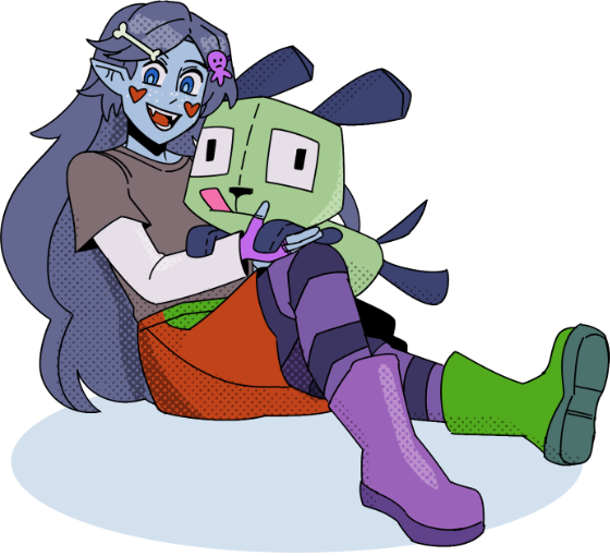
For Artfight 2025, I thought it would be fun to do some graphic design for the characters I wanted to attack.
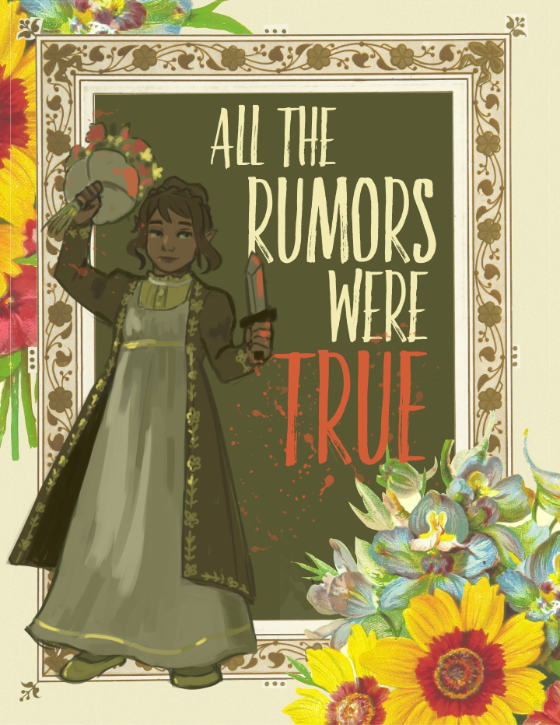
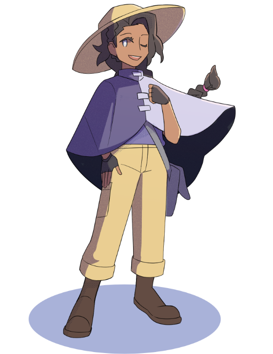
In 2024 I made a fake book cover for Allium-Silk's character Camille. I had such intense joy working on it! My corporate graphic design job at the time was very strict on following OEM brand guidelines and I didn't have much leeway to play around with design elements. I had to use the same old sans serifs fonts, I had to stick to a template, I had to use certain colors, etc! But artfight opened the tightly shut door of graphic design I had long since abandoned.

Mirror text from my Pillowfort Blog
Original Post Date: July 23, 2025
The initial plan / gimmick for this year was to make some sort of graphic design for each character, but after artfight #2 i realized that I was spending a lot of time on just one drawing and wouldn't be able to do revenges!
A note on the graphic design!
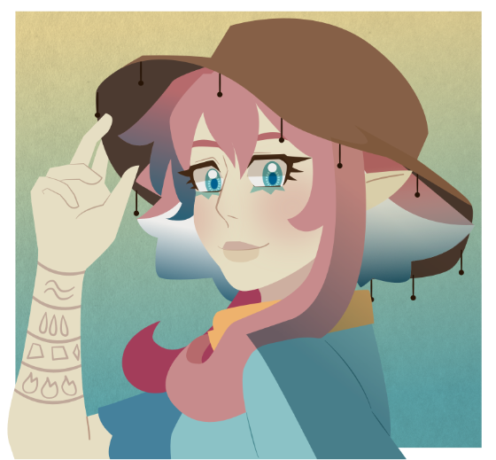
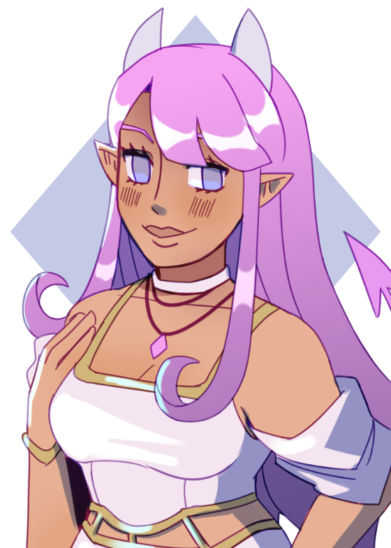
Gothic lolita makes me nostalgic, I love the vibe for it so I thought a good header font would be Funny Pirates, a serif font. From what I vaguely understand the gothic lolita fashion sense has influence from Eurocentric culture. Serif fonts tend to have that 'older' type of vibe. However, 'Funny Pirates' has a bit of modernity to it's type, it's not as high-strung as most serif fonts would appear to be. It's kind of inviting, yet a little aged - a bit like a cafe from 2002 that's still up and running somehow.
Alongside it is the Aeroko font, something san-serif. Gothic Lolita in, itself is a very bold design choice! So a bold, clear font would work here.
Mirror text from my Pillowfort Blog
Original Post Date: July 26, 2025
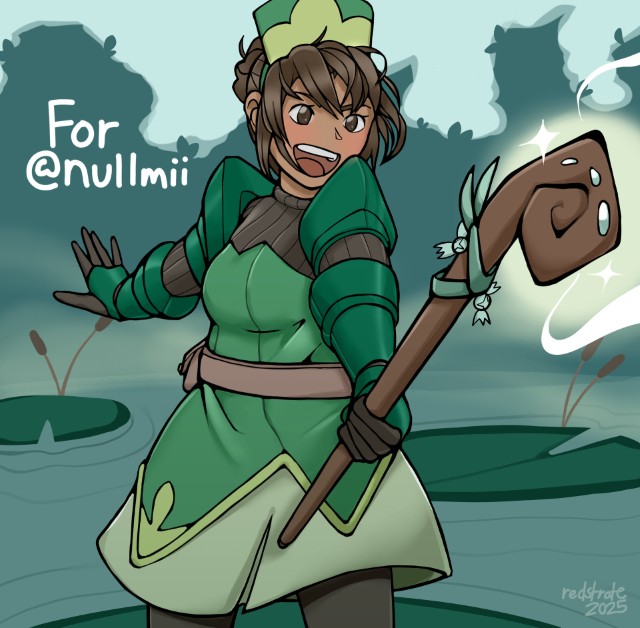
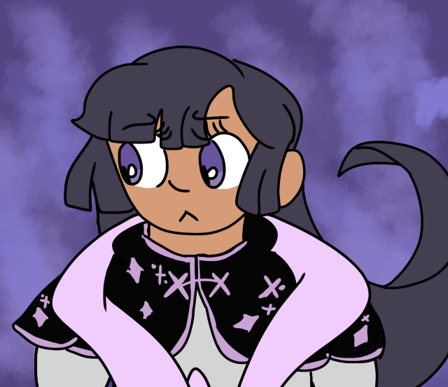
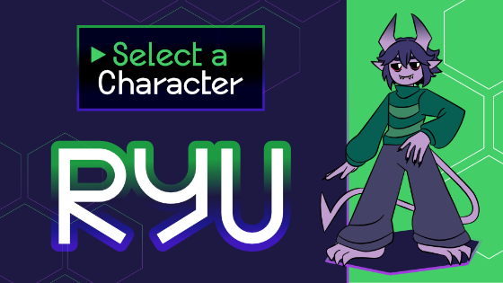
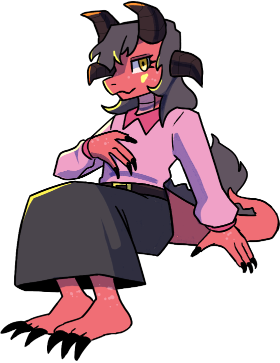
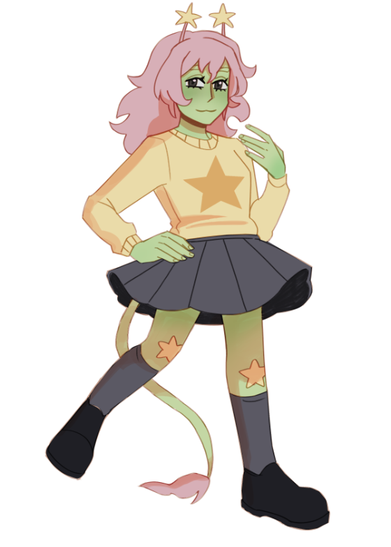
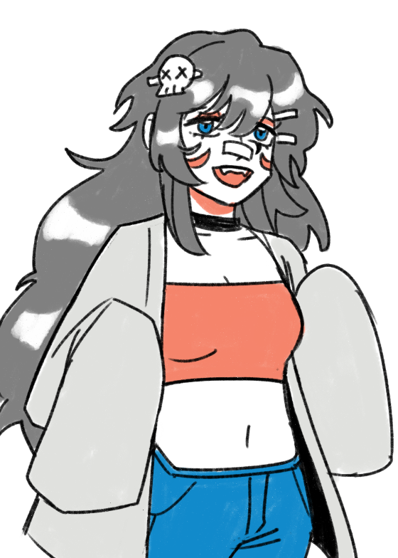
When I start these designs I like to carefully look at the reference art and make notes on what I think would be a neat design for them. What I noticed about Ryu is that they had a lot of sharp angles! Pointed horns, a sharp tail, and sharp claws and feet.
Ryu had a lot of geometric looking angles, so I wanted to pick a geometric font. Geometric fonts are popular in modern day design, however they really should be used sparingly. The have uniform repeatable shapes which don't make them the best for legibility.
However, using them as a header or a stand-out element is perfectly fine! They make a design look approachable and friendly with a touch of professionalism that most sans serif fonts lack.
For this design specifically I chose Heal the Web. Although it's a geometric font it has some quirky qualities to it that I think suited Ryu! I know for most "game inspired" graphic design, people opt for pixel fonts, but personally I think pixel text gives off an old-school retro game feel.
The great thing about the Heal the Web font is that is has 2 versions! One is more legible and the other has those stylized characters. Plus, it comes with a lot specialized glyphs and symbols! it's an open source font so that means people can use it for free!

[1]:
Seriously though, can we pivot away from intrusive messaging apps and go back to RSS.
Return to Text
[2]:
Site users would submit attacks (gift art) with misleading thumbnails, often depicting a version of the gift art that appears to have been drawn by a novice.
Return to Text
[3]: By the way, this isn't a slight or "vague" on any one who also did this to my characters during this year's artfight. I am aware that viral trends exists for a reason, and some might find that hopping on the bandwagon invokes a sense of community and camaraderie amongsts other participating artists. It's an in-joke, it's all fun. Please, I sincerely wish for people to enjoy themselves! Don't let my complaining ruin your fun, haha. I'm just a bit of a curmudgeon, but I'm a curmudgeon who has learned my tastes and thoughts are nitpicky and very specific, lol. Return to Text
[4]: As a victim of bad art tutorials from amazing artists, I implore the plethora of budding artists to learn from all types of creators. Art influencers on social media are just a tiny fraction of the creative community after all. Return to Text
Back to Blog Blog Archive
Sitemap ✦ Credits ✦ Resources ✦ Site Profile ✦ ![]() RSS Feed
RSS Feed